REF: Matplotlib
Введение
import numpy as np, matplotlib.pyplot as plt
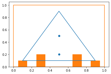
plt.plot ((0.1, 0.5, 0.9, 0.1), (0.1, 0.9, 0.1, 0.1))
plt.plot ((0, 0, 1, 1, 0), (0, 1, 1, 0, 0))
plt.scatter( [0.5, 0.5], [0.2, 0.5])
plt.bar ([0.1,0.3,0.7, 0.9], [0.1,0.2,0.2,0.1], width=0.1)
plt.show()
import numpy as np
import matplotlib.pyplot as plt
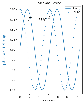
plt.figure(figsize=(8,4))
plt.plot (x, np.sin(x))
plt.scatter (x, np.cos(x), s=5)
plt.xlabel('x axis label')
plt.ylabel(r'phase field $\phi$',
{'color': 'C0', 'fontsize': 20})
plt.title ('Sine and Cosine')
plt.legend(['Sine', 'Cosine'])
plt.text(4, 0.75, r'$E=mc^2$',
{'color': 'black', 'fontsize': 24,
'ha': 'center', 'va': 'center'})
plt.show()
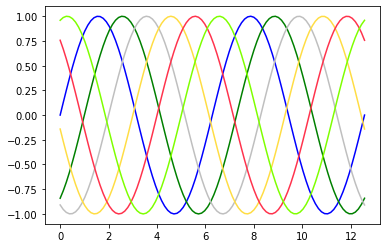
Цвета и стиль линий
import numpy as np
import matplotlib.pyplot as plt

x = np.linspace(0, 4*np.pi, 100)

plt.plot(x, np.sin(x - 0), color='blue')
plt.plot(x, np.sin(x - 1), color='g')
plt.plot(x, np.sin(x - 2), color='0.75')
plt.plot(x, np.sin(x - 3), color='#FFDD44')
plt.plot(x, np.sin(x - 4), color=(1.0,0.2,0.3))
plt.plot(x, np.sin(x - 5), color='chartreuse')
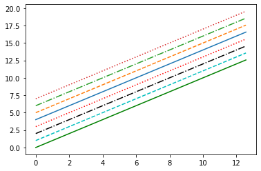
plt.plot(x, x + 0, '-g')            # solid green
plt.plot(x, x + 1, '--c')           # dashed cyan
plt.plot(x, x + 2, '-.k')           # dashdot black
plt.plot(x, x + 3, ':r');           # dotted red
plt.plot(x, x + 4, linestyle='-')   # solid
plt.plot(x, x + 5, linestyle='--')  # dashed
plt.plot(x, x + 6, linestyle='-.')  # dashdot
plt.plot(x, x + 7, linestyle=':')   # dotted
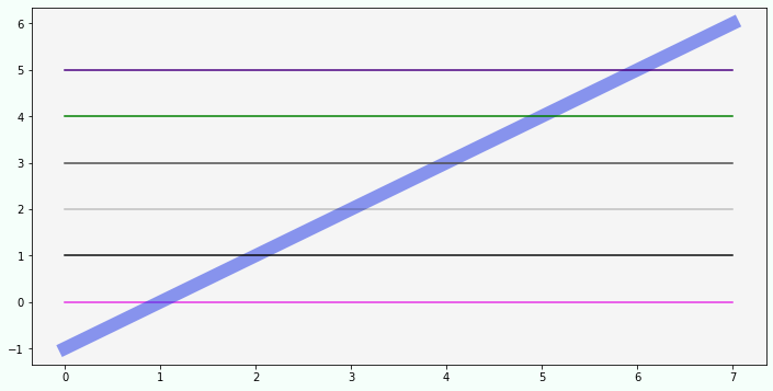
x = np.zeros(8)

fig, ax = plt.subplots()

ax.plot(np.arange(-1, 7),
        color=(0.1,0.2,0.9,0.5),
        linewidth=12)
ax.plot(x,   color=(0.9,0.2,0.9))# RGB
ax.plot(x+1, color='#0a0b0c')    # hex RGB
ax.plot(x+2, color='#0a0b0c3a')  # hex RGBA
ax.plot(x+3, color='0.3')        # уровень серого
ax.plot(x+4, color='g')          # b,g,r,c,m,y,k,w
ax.plot(x+5, color='indigo')     # название из X11/CSS4

fig.set_figwidth(12)
fig.set_figheight(6)
fig.set_facecolor('mintcream')
ax.set_facecolor('whitesmoke')

plt.show()
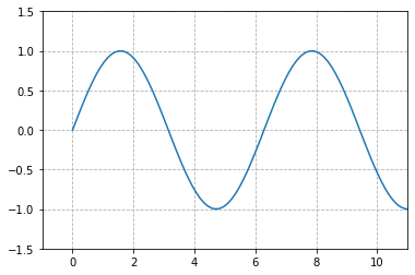
Оси, масштаб
import numpy as np
import matplotlib.pyplot as plt

plt.plot(x, np.sin(x))

plt.xlim(-1, 11)
plt.ylim(-1.5, 1.5);

plt.grid(True, linestyle='--')
ax = plt.figure().add_subplot(1, 1, 1)

plt.plot(x, np.sin(x))
plt.axis([-1, 11, -1.5, 1.5]) # [xmin, xmax, ymin, ymax]

majors, minors = np.arange(0,11,2), np.arange(0,11,1)

ax.set_xticks(majors); ax.set_xticks(minors, minor=True)
ax.set_yticks(majors); ax.set_yticks(minors, minor=True)

ax.grid(which='major', color='#CCCCCC', linestyle='--')
ax.grid(which='minor', color='#CCCCCC', linestyle=':')
plt.plot(x, np.sin(x))
plt.axis('tight'); # все точки поместятся
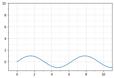
plt.plot(x, np.sin(x))
plt.axis('equal') # одинаковый масштаб по x и y
ax = plt.axes()
ax.plot(x, np.sin(x))
ax.set(xlim=(0, 10), ylim=(-2, 2), xlabel='x', ylabel='sin(x)', title='A Plot')
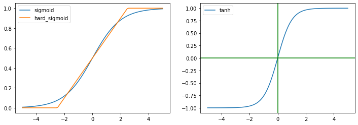
Объединение графиков
x = np.linspace(-5,5, 100)
y = np.where(x < -2.5, 0,
       np.where(x < 2.5, 0.2*x+0.5, 1))

plt.figure(figsize=(12,4))
plt.subplot(1, 2, 1)
plt.plot(x,1/(1+np.exp(-x)))
plt.plot(x,y)
plt.legend(['sigmoid', 'hard_sigmoid'])

plt.subplot(1, 2, 2)
plt.plot(x, np.tanh(x))
plt.axvline(0, c="g")
plt.axhline(0, c="g")
plt.legend(['tanh'])
plt.show()
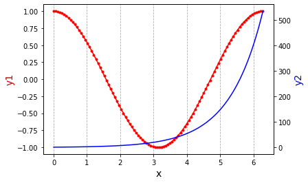
x = np.linspace(0,2*np.pi,100)
y1, y2 = np.cos(x), np.exp(x)

fig,ax = plt.subplots()
plt.grid(axis = 'x', color='#AAA', linestyle='--')

ax.plot(x, y1, color="red", marker=".")
ax.set_xlabel("x", fontsize = 14)
ax.set_ylabel("y1", color="red", fontsize=14)

ax2=ax.twinx()
ax2.plot(x, y2, color="blue")
ax2.set_ylabel("y2",color="blue",fontsize=14)
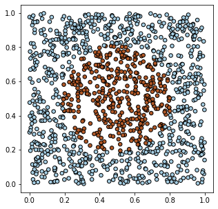
Рассеяния
import numpy as np
import matplotlib.pyplot as plt

np.random.seed(1)
x_dat = np.random.rand(1200, 2)
y_dat = np.sum((x_dat-0.5)**2, axis=1) < 0.1

plt.figure (figsize=(5, 5))
plt.scatter(x_dat[:,0], x_dat[:,1],
            s=30, c=y_dat, cmap=plt.cm.Paired, edgecolors='k')
plt.show()
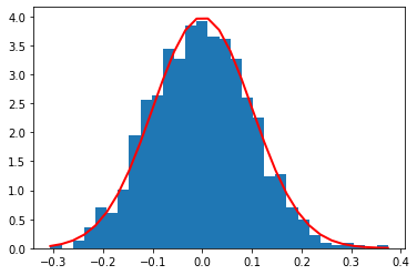
Гистограммы
import numpy as np
import matplotlib.pyplot as plt

mu, sigma = 0, 0.1
s = np.random.normal(mu, sigma, 1000)
count, bins, ignored = plt.hist(s, 30, density=True)

plt.plot(bins,
        1/(sigma*np.sqrt(2*np.pi)) * \
        np.exp(- (bins-mu)**2/(2*sigma**2) ),
        linewidth=2, color='r')
plt.show()
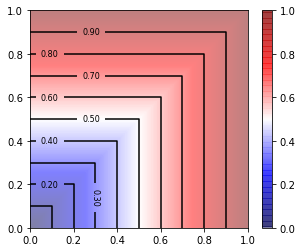
Карта высот
X_MIN, X_MAX, DX, Y_MIN, Y_MAX, DY = 0,1,0.01,  0,1,0.01
x = np.arange(X_MIN, X_MAX+DX, DX)
y = np.arange(Y_MIN, Y_MAX+DX, DX)

X, Y =  np.meshgrid(x, y)     # 2D массивы

Z = np.maximum(X,Y)           # значения высот

plt.figure(figsize=(5,4))     # размер картинки (с баром)
plt.imshow(Z, extent=[X_MIN, X_MAX, Y_MIN, Y_MAX],
           origin='lower', cmap='seismic', alpha=0.5)      # как полупрозрачную картинку
plt.colorbar()                                             # справа столбик значений

contours = plt.contour(X, Y, Z, 11, colors='black')        # контурные линии
plt.clabel(contours, inline=True, fontsize=8, fmt='%1.2f') # с высотами

plt.show()
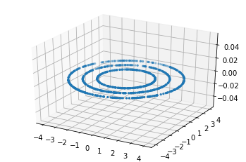
3D графики
from mpl_toolkits.mplot3d import Axes3D

N1 = 1000
phi = 2*np.pi*np.random.random((N1,))
r   = np.random.randint(2,5,(N1,))

X = np.zeros((N1,3))
X[:,0] = r*np.cos(phi)
X[:,1] = r*np.sin(phi)

fig = plt.figure()
ax = fig.add_subplot(111, projection='3d')
ax.scatter(X[:,0], X[:,1], X[:,2], s=5)
plt.show()
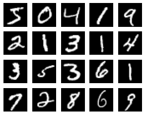
Вывод картинок
import numpy as np
import matplotlib.pyplot as plt
from keras.datasets import mnist

# load mnist dataset
(x_train, y_train), (x_test, y_test) = mnist.load_data()

plt.figure(figsize=(5, 4))         # plot the 20 mnist digits
for i in range(20):
    plt.subplot(4, 5, i + 1)
    plt.imshow(x_train[i,:,:], cmap='gray')
    plt.axis('off')
plt.show()
Информация